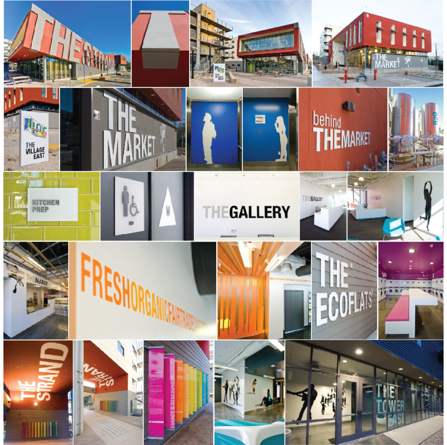
About Project
Such an honor to be included in this team of brilliant architects and interior designers. As you can see we all worked very closely to make sure that the branding was seamless. The budget was extremely tight so we had to be quite conservative but also smart with what we spent the money on. The large lettering on the side of the building was about 20′ x 100′ and was compressed foam and wiring mesh, with a final stucco finish to give the effect of it being “born” out of the building. Much of the building ID’s were painted
aluminum lettering, inside graphics (the people for the elevator lobbies were the students and our entire team) were vinyl and the LEED graphics were acrylic panels.
Project Details
- Categories:Environmental

