About Project
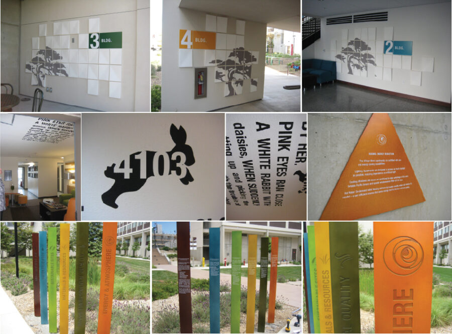
The concept for this campus was the idea of puzzles and complexity. UCSD told us they want to get the students out of their rooms and into the common spaces and intermingling, so we designed large six foot dimensional numbers (seen above – top) and directionals that had a die-cut logo and stand off words.
The set of images towards the bottom are the dimensional letters I did for each common space, the average about 1.5″ thick, 2′ tall and 6′ long, with a different thickness between back and front of glass, to give the illusion of cutting through the glass or a sense of floating. Each letter’s concept is the breakdown of the typeface and highlighting the essential forms. The interior graphics (being fabricated now) are large interactive puzzles and bigger than life tic tac toe boards. We wanted the students look at each piece and see something new every time, to experience it as it is and how they want to interpret it.
Project Details
- Categories:Environmental

